CSS Explained | The Layout

In this story, we’ll discuss the most critical aspect of CSS that we use every day. Many of us find it challenging to use or troubleshoot, aka, CSS Layout.
CSS Layout pertains to how HTML elements will be positioned by the browser on the page and how these elements will relate to each other. In essence, it’s all about Page Geometry.
Once you understand CSS Layout techniques and rules, you’ll be able to construct the necessary structure from the design team with ease.
So let’s start understanding it right to use it right 👌!
The Box Model
CSS models every HTML element to a box, this box has the following properties: content, padding, border, margin
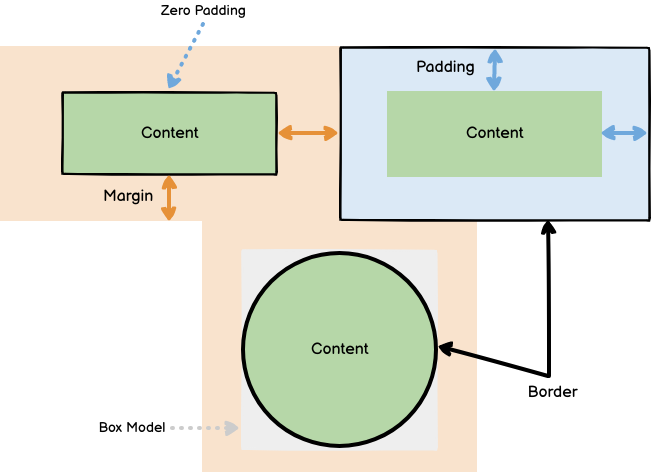
As we see in Figure 1.1, we notice the following:
→ Content is represented by green areas.
→ Padding is the space between the content and the border.
→ Margin is the space between elements each other.
We can control the padding, border, and the margin values using CSS as following:
Shorthand methods
→ for margin & padding
- TRBL
margin: top right bottom left - T[RL]B
margin: top right/left bottom - [TB][RL]
margin: top/bottom right/left
Example 1.1
margin: 20px 20px 15px 10px;
padding: 20px 15px 10px; /* left and right is 15px */
margin: 20px 10px; /* top and bottom is 20px, left and right is 15px */ padding-top: 20px;
margin-left: 10px;
→ for border
border: width style color
Example 1.2
border: 1px solid #000;
border-left: 3px solid black;
Content width & height
the content area width or height, by default, is computed by the content size of it unless the author applies a specific width or height to it, and here comes the role of box-sizing property to calculate the content width and height as follows.
Box Sizing
this property describes how CSS calculates the width and height of the elements.
acceptable values: content-box | border-box
default value: content-box

As we see in Figure 1.2:
→ in Figure 1.2 (a), with content-box, if we set the element width: 100px, that’s means that the content width will be 100px.
→ in Figure 1.2 (b), with border-box, if we set the element width: 100px, and for example the padding-right & left is 10px, and the border width is 1px, then the content width will be (100 px — 2*10px — 2*1px) → 78px.
Further Information 📚
Bootstrap framework used inline-block display (before using flex) for building its grid system, and usedbox-sizing: border-box;to compute the columns width right, to prevent elements overflows if the users apply a border and padding values.
Here we explained what is the Box Model and the css properties which controls the size of it, but sometimes, you will not be able to change some of those values based on display type of the HTML element.
Display types
In CSS, we have a property called display that controls how will the element be displayed in the page i.e. list-item, table-cell, block or flex.
There are a lot of display modes in CSS, each HTML element has a default display value, for example:
- div has a default display value of block.
- span has a default display value of inline.
- td has a default display value of table-cell.
Let’s explore the most important display types,
block display
examples: div, p, h1, h2
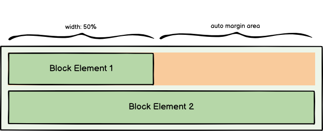
Block HTML element properties
- width default value is 100% of its parent.
- height & width is editable.
- All margin values are editable.
- Block elements can’t be distributed horizontally.
inline display
examples: span, a, button

Inline HTML element properties
- width default value is summation of content, padding and borders.
- height & width is not editable.
- top & bottom margin values are not applied.
- Inline elements can be distributed horizontally.
inline-block display
Inline block combines the inline and block displays good characteristics
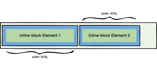
Inline-block HTML element properties
- width default value is summation of content, padding and borders.
- height & width are editable.
- All margin values are editable.
- Inline-block elements can be distributed horizontally.
Further Information 📚
before inline-block, developers used tables to build grid systems because both inline and block displays doesn’t satisfy the grid systems needs.
none display
from its name, display none remove the element completely from the rendered DOM tree. it is used conditionally to show or hide elements from the page.
flex display
In 2017, W3C introduces a new layout called flex layout (use flex-box) to provide more efficient way to create layouts, align and distribute elements in the page.
let’s have a quick overview about the flex-box
flex container (parent) properties
display: flexwe add this property to the parent element to the elements which we need to act toward flex-box rules.direction: row | column | row-reverse | column-reverseto control the flow direction of the flex elements.justify-content: flex-start | center | space-betweento control how the flex elements is distributed horizontally inside the container.align-items: flex-start | center | flex-endto control how the flex elements is distributed vertically inside the container.gap: 10pxto determine the space between flex elements.
flex elements (children) properties
order: 2to control the position of the flex element among the other elements.flex: 2to control the percentage of the flex element width among the other elements.
I highly recommend this article for more info about the flex-box.
grid display
The first official layout to implement the grid system fully (two-dimensional flow).
it is better to check this article for more info about the grid layout.
We saw in the previous section different display patterns to distribute and align the HTML elements in the page.
In the next section, we will discuss the position property which controls only how the element will position into the page or related to other elements regardless to the display layout of the HTML element.
Position types
static position
It is the default position for all HTML elements.
- Static position follows the display layout of the element.
- we can’t apply top, bottom, left and right properties to static elements.
the following position types will force the position characteristics regardless to the display layout of the element.
relative position
it acts as a static position until we change its top, bottom, left and right properties.
- Relative position follows the display layout of the element.
- we can apply top, bottom, left and right properties to relative elements.
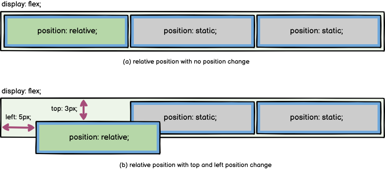
As we see in Figure 3.1
→ in Figure 3.1(a), the relative position acts like static position.
→ in Figure 3.1 (b), when we change its left and top properties it changes its position relative to the values of the left and top properties.
absolute position
Elements with absolute position is located based on the nearest relative ancestor if found or the root element (body).
- Absolute position doesn’t follow the display layout of the element.
- we can apply top, bottom, left and right properties to absolute elements.
- Absolute elements positions in the topmost and leftmost (rightmost for RTL direction) of the nearest relative ancestor (until we change position values).
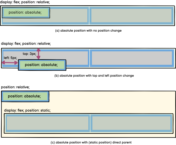
As we see in Figure 3.2
→ in Figure 3.2 (a), the element with static position doesn’t follow the normal flow of flex display and is located on the topmost and leftmost of the parent relative element.
→ in Figure 3.2 (b), when we change its left and top properties it changes its position relative to the values of the left and top properties.
→ in Figure 3.2 (c), when the direct parent has no relative position, the element seeks for the nearest relative ancestor and is located on the topmost and leftmost of it.
fixed position
fixed position is relative to the viewport
- Fixed position doesn’t follow the display layout of the element.
- we can apply top, bottom, left and right properties to fixed elements.
- Fixed elements positions in the topmost and leftmost (rightmost for RTL direction) of the viewport (until we change position values).

As we see in Figure 3.3
→ in Figure 3.3 (a), fixed position element is located on the topmost and leftmost of the viewport and above the other elements of the page.
→ in Figure 3.2 (b), when we scroll the page, fixed position element sticks with the same position always.
sticky position
scroll position ≤ element’s top position ? relative : fixed

- Sticky position element acts as relative when page scroll position is less than or equal its top position value.
- Sticky position element acts as fixed when page scroll position is more than its top position value.
here, we covered all position types and how to differentiate between them to use them in the right manner.
In this story, we have covered the most important topics related to CSS layout that you rely on them on the daily basis. Stay tuned for the next story about the Stacking context🤘.